In this article we present some awesome free high-quality WordPress themes from 2011, which have been released over the last few months. Whether you are looking for some design inspiration or professional coding solutions, high-quality WordPress themes always come in handy.
Most of the themes below can be tailored via the options panel to be anything you want, whether a portfolio, a content-heavy magazine-style website or a basic blog. We like to share them with our readers, making both our personal work and the work of fellows developers easier. They all can be downloaded, customized and used for free in both personal and commercial projects. Links to demo-versions provide a direct preview of a theme. They’re definitely worth a look.
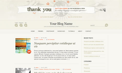
As the name suggests, Anniversary was built as a celebration of and thank-you to WordPress. It’s a classic-looking theme, with several layout options and a customizable “Thank you, WordPress” banner in the header.
This one’s a lovely clean theme.
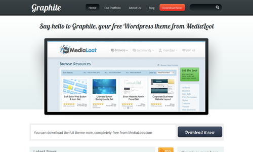
Graphite, built by Medialoot from the ground up using HTML5 and CSS3, comes with portfolio post types, two alternative home page image sliders and built-in admin settings.
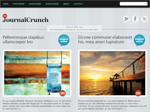
Journal Crunch is a gallery and portfolio theme with all of the features you would expect from a premium theme: easy set-up via the options page, plenty of shortcodes, built-in pagination, Twitter widgets, AJAX contact form and much more.
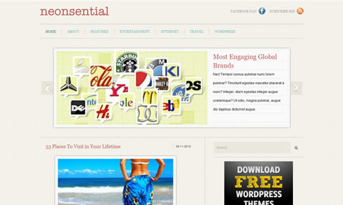
Neonsential brings a grungy yet elegant look to your blog. The fancy home page slider highlights your featured posts. It is WordPress 3.0-compliant and backed by a robust framework for quickly setting up your website.
Amphion Lite comes packaged with two skins, a home page content slider, integrated social sharing buttons, custom page templates and a lightbox plug-in for image galleries.
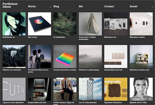
Portfolium is a clean and flexible WordPress grid-based portfolio theme, designed in a modern and minimalist style. It is ideal for designers, artists, photographers and other creative specialists who require a professional portfolio theme.
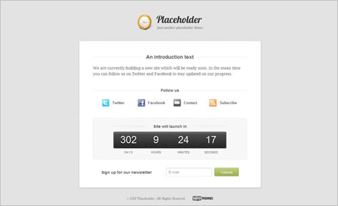
This landing page is perfect if your website is in development and you simply need to let visitors know how to get in touch with you. Also, the built-in countdown timer is a nifty way to tell visitors when the project will launch.
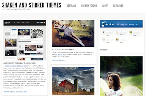
Shaken Grid uses the jQuery Masonry plug-in, which “arranges elements vertically then horizontally according to a grid.” The theme is perfect if you need a gallery or portfolio or just want a unique grid layout.
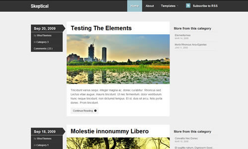
Skeptical’s layout is flexible: you can display “Related posts” next to your latest posts on the home page or have a completely widget-based sidebar. You can also add your Flickr stream to the footer and showcase three noteworthy blog posts with a tag that you declare in the settings.
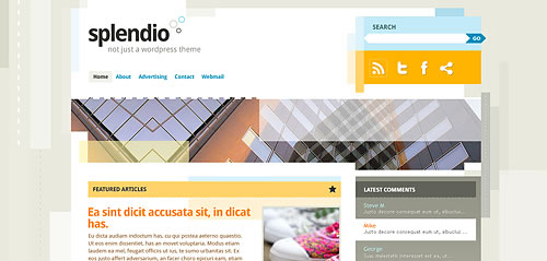
Splendio has a unique magazine-style design, based on the TwentyTen theme.
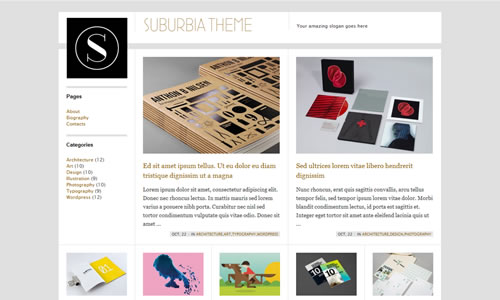
Suburbia is a clean and flexible grid-based magazine theme with a modern and minimalist style. The theme is suitable for most types of websites, including blogs, online magazines and portfolios.
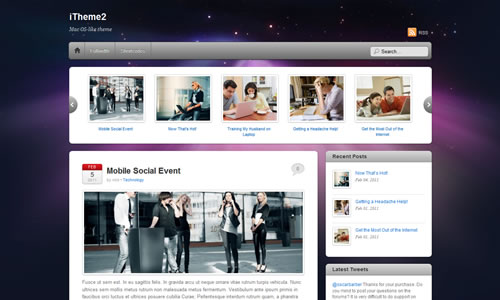
iTheme2 is the perfect theme for technology- and Apple-related blogs. It uses media queries to target different displays, such as desktops, notebooks, iPhones and iPads, and other mobile devices, without a plug-in. The layout automatically adjusts to the user’s viewing area.
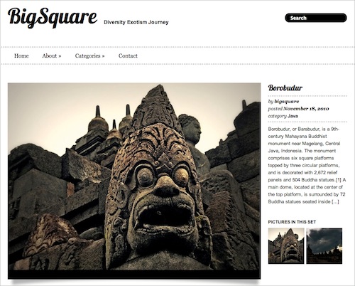
Big Square is a stylish photoblog theme with a built-in gallery that is focused entirely on highlighting your creative visuals.
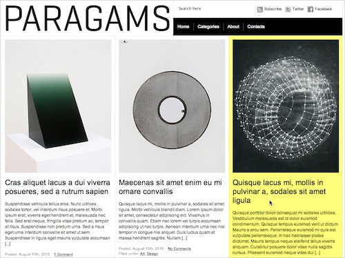
Paragams is a lightweight theme that is built on a grid and that could be used for various types of websites: portfolios, photoblogs even online magazines.
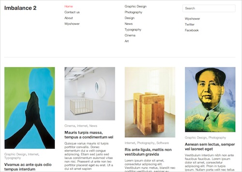
Imbalance 2 turns you WordPress-based website to an attractive blog, portfolio or online magazine. This free template has a strictly modern style with a minimalist touch.
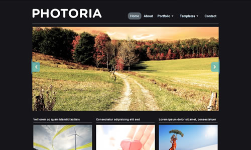
Photoria is a clean feature-rich theme that would be perfect as a photoblog or portfolio. It comes packaged with a variety of templates and built-in SEO (via its extensive options page), and the theme is internationalized for easy translation.
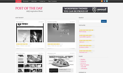
Muse is a simple gallery theme that can be used as either a portfolio or an inspirational showcase. It comes with custom page templates and built-in SEO, and it can be combined with a ratings plug-in to create an all-singing, all-dancing showcase website.
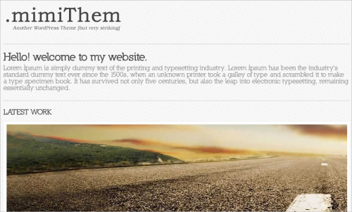
This is far and away the most basic theme in this article. But don”t be fooled: it works effectively as a quick and easy way to get your portfolio online.
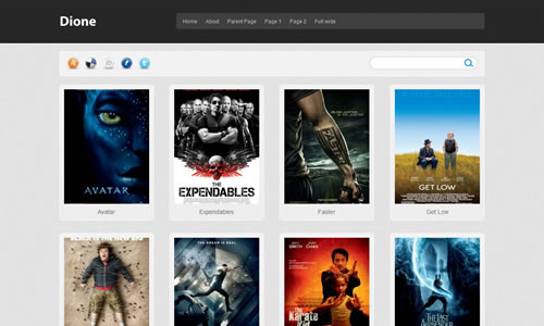
Dione is a video showcase theme that uses the custom post type feature available in WordPress 3+.
Academica was designed specifically for educational institutions such as universities and schools. It’s a flexible and versatile free theme that can be easily customized and branded for any university, academy or non-profit organization.
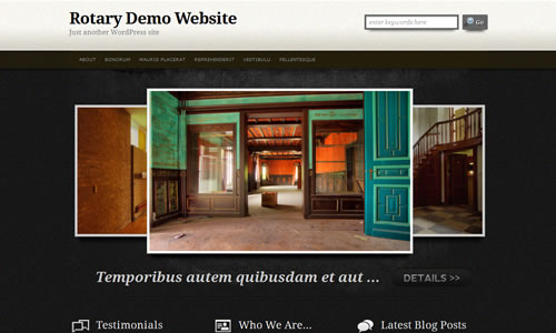
Rotary is a two-column business theme that was built with all of the fantastic features of WordPress 3.0. It is centered on the idea of running your blog as a CMS.
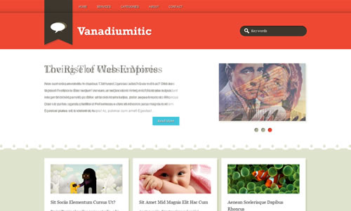
Vanadiumitic (the link was removed due to the suspicious code of the theme)
Vanadiumitic comes with a featured content section, a dropdown menu, subscription buttons (Twitter, Facebook and RSS), an automatic thumbnail resizer, and widgets for popular and featured posts and featured videos, all packed in a powerful framework for easy back-end customization.
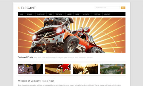
Elegant is a simple yet professional theme. It has two color schemes (black and white) and is best suited to corporate magazines but is flexible enough for blogs and portfolios.
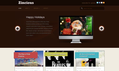
The Zincious theme comes with a dropdown menu, subscription buttons (Twitter, Facebook and RSS), an automatic thumbnail resizer, a widget for popular posts, a featured content slider and a robust framework for easy back-end customization.
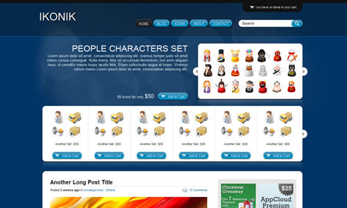
Ikonik was designed as an online design store, although no e-commerce system is integrated. It could be used as a simple portal for selling vectors, icons, logos, buttons, themes and pretty much anything else.
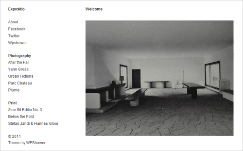
Expositio is a simple portfolio theme for photographers, designers and artists. Its integrated options help you customize the template from font to color.
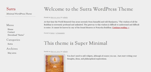
Sutra is a minimal theme focused on simplicity, putting the writing front and center.
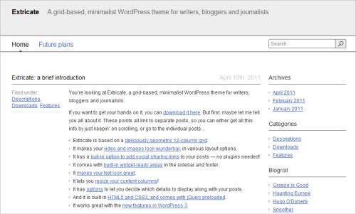
Extricate is a clean, minimal theme built on HTML5 and CSS3. The options page allows you to resize columns and specify post information.
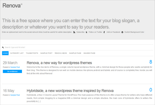
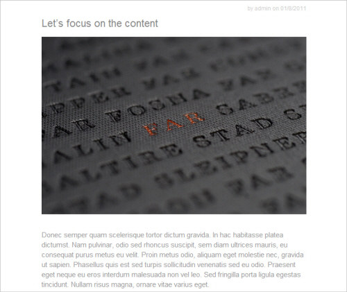
Renova comes with two backgrounds (full white or paper), six link colors, jQuery support for hover effects and mobile device support. The minimal style is for writers who need a simple layout without any distraction.
This is a four-column layout with a simple sidebar and was designed using the jQuery Masonry plug-in.
This minimalist theme features big images, a clean style and easy browsing: perfect for modern blogs and portfolios.
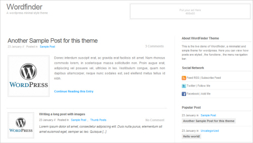
Wordfinder is a simple magazine-style theme for users who want to start a blog with a minimal layout. The theme has many layout features, including two home page styles and six colors for links and hover effects that are easily customizable via the options page.
This jQuery-based, Cufon-enabled, lightweight and minimal WordPress theme was developed by Timothy Long.
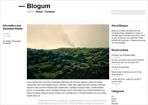
Blogum is a simple grid-based blog theme, designed with a modern and minimalist style. It supports all WordPress 3.0 features, giving you extra flexibility.
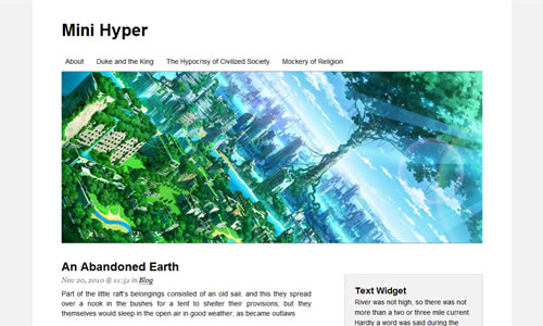
Mini Hyper comes with a basic options page where you can add your analytics tracking code and change the logo. Other than that, Mini Hyper is widget-ready and works in all browsers.
“No bells and whistles, just simple and to the point.” Min’s main content area is set at 560 pixels, and it has two widget-ized footer areas to handle navigation and anything else you feel like putting there.
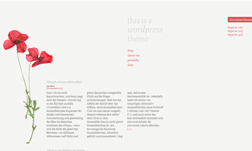
Papaver is an elegant, minimal theme. You can set the content to one, two or three columns.
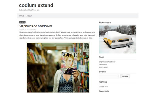
Codium Extend is a minimalist theme that supports all of WordPress 3+’s features and comes with support for smartphones (iPhone, etc.) and tablets (iPad, Galaxy Tab, etc.).
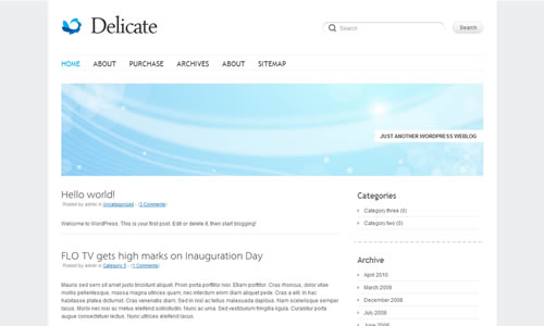
Delicate is a clean, minimalist theme with a focus on typography and structure.
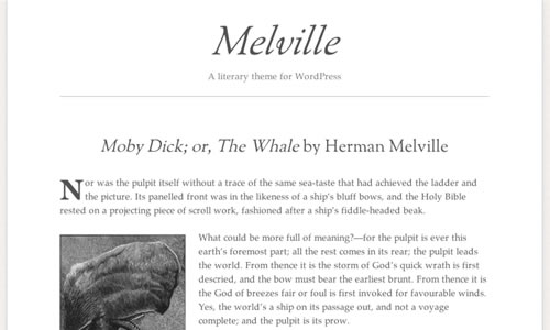
Melville was inspired by classic literature. It has no distractions; just a simple design that focuses the reader on your writing.
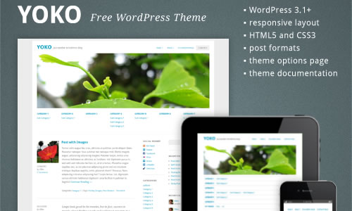
Yoko is a modern and flexible theme, with a responsive layout based on CSS3 media queries. The design is optimized for big desktop screens, tablets and smartphones. You can use new post formats (such as Gallery, Aside and Quote), choose your own logo and header image, and customize the background and link color.
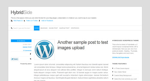
With a minimal design and simple structure, Hybridside allows writers to choose the body background and the color scheme for links. It has full support for thumbnails, WordPress menu navigation, five widget areas and a print-friendly style sheet.
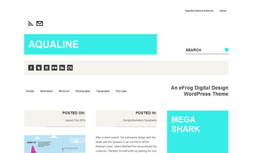
Aqualine is a unique and minimalist theme that has an extensive options page. Pick your own color accent, choose between thumbnails and excerpts or the full content for the main page, and more.
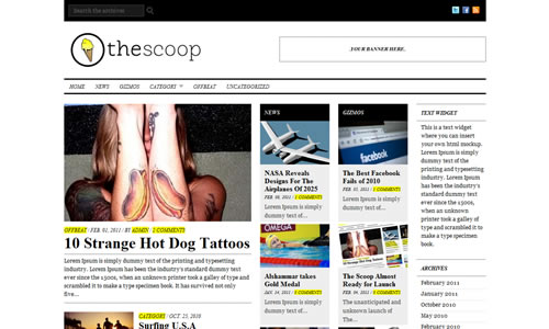
The Scoop is a four-column minimal magazine-style theme, with a focus on elegant typography. It is ideal for content-heavy websites.
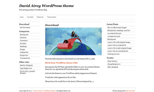
David Airey has released his old blog’s design as a free WordPress theme. As you probably know, that minimal design offers the perfect platform for your writing.
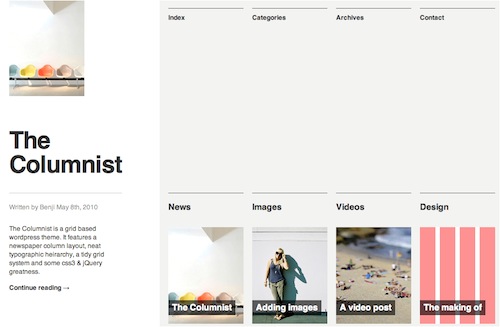
The Columnist was inspired by the grid structure and typographic techniques of traditional newspapers. It was designed with a grid-based layout, an elegant typographic hierarchy and some CSS3 and jQuery greatness.
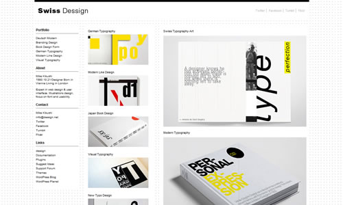
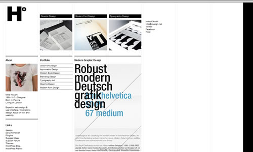
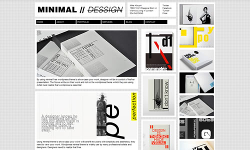
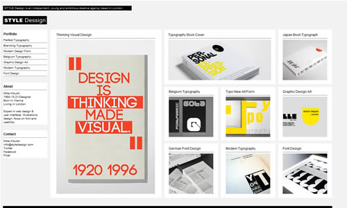
The four themes below are simple yet powerful, with a touch of traditional Swiss design and layout. Their distinct style is what separates them from the other themes. They allow you to select the focus of your work, since you are the artist and should be in control of the visitor’s experience. Each theme comes with a full video overview and support for using and managing it.
This is perhaps the most basic WordPress theme you’ve ever seen. It’s so basic that it’s not even worth showing a screenshot of it. But it is useful. It’s a fully functional theme that would be perfect for anyone looking for a barebones WordPress framework. It has only 83 lines of PHP and 75 lines of CSS.
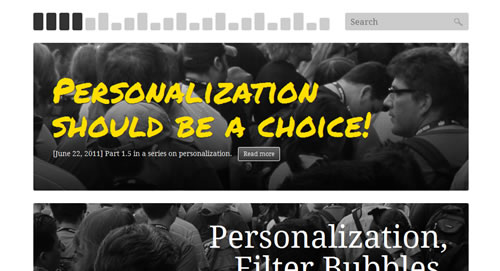
Protean is a WordPress theme from Landau Reece that allows bloggers to customise their website design for individual blog posts.
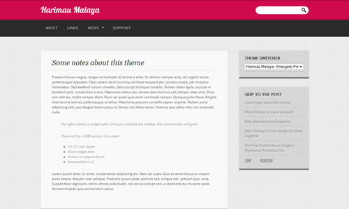
Harimau Malaya was purpose-built as a throwback to when blogs looked like blogs. It is a simple but complete theme, suitable for every blogger out there.
Pongsari, a simple and clean theme, was built using the WordPress 3+ default theme TwentyTen as a framework. It comes with support for WordPress 3+ thumbnails and custom menu functions.
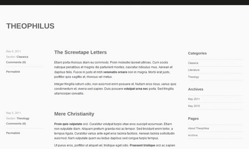
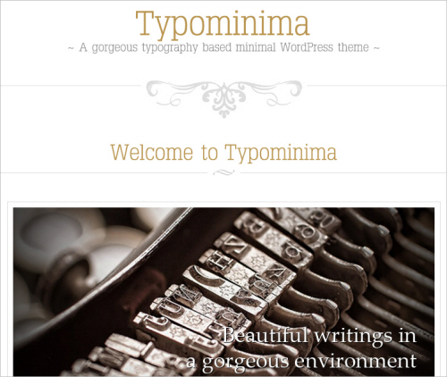
Typominima is a free, minimal typography-based theme that was designed to enable writers and publishers to express themselves online in a clean and beautiful environment.
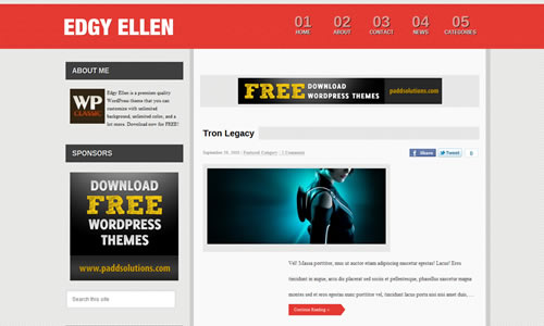
This theme from WP Classic has a stylish design, clean grid patterns and custom typography. It comes with an options panel that will help you set up your website in no time.
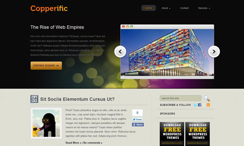
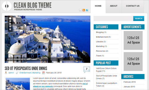
Copperific has a stylish slider to showcase highlights of your portfolio. It also has a built-in Twitter and Facebook button for easy sharing of posts. For monetization, it has four 125×125 banner ads that are integrated in the system’s back end. It has a custom dropdown menu, an automatic thumbnail resizer, a widget for popular posts and a lot more.
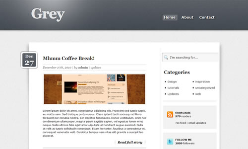
Grey is generic enough to be used for almost any kind of blog. Whether it’s a blog about design, photography, fashion or some other passion, the Grey theme should suit your needs. It is built on a simple layout, but with a lot of little touches of subtle details and textures.
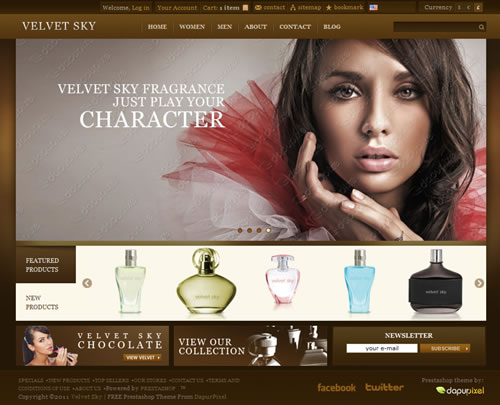
Velvet Sky is a Prestashop and WordPress shopping theme. It features a custom homepage with combo slider, horizontal and submenu menu integration, custom slideshow, it supports one page checkout and guest checkout and is IE7+, Safari, Opera, Firefox, Chrome compatible.
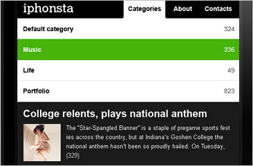
Offering a mobile version of your website is an easy way to strengthen your visitors’ loyalty. iPhonsta has a fluid layout, it fits most mobile screens (despite its name, it will work on most smartphones), and it configures the font size automatically.
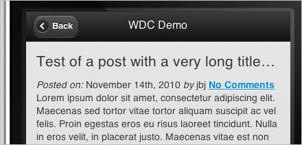
This theme is optimized for mobile devices, such as iPhone, Android and BlackBerry. It is a great starting point for building a mobile website.
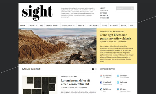
Sight is a powerful theme that is best suited to magazines-style blogs. It was built on a grid and has a modern minimalist style. Customize the content view using either the standard blog view or the grid view.
Plenty of CSS3 techniques are used in this theme. You will notice both loud and subtle text shadows in the headings, text orientation effects and box gradients. The theme also makes use of Google fonts, which render much faster than the popular Cufon fonts.
This theme could be used for a magazine-style website or, just as effectively, for a corporate or business layout. It comes with a basic options page, built-in pagination, a content slider and integrated social bookmarking buttons.
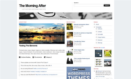
At 100,000 downloads, The Morning After is the grandfather of modern WordPress magazine themes. Originally designed by Arun Kale, it was bought last year by WooThemes, which has restructured and modernized the theme with its own powerful development framework.
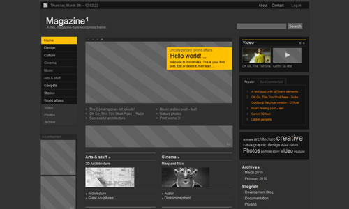
With its simple, stylish and dark design, Magazine 1 is a professional solution for any blog or magazine website. It features jQuery content sliders, a “Most popular posts” widget and multiple colors for the background and content. It is easy to customize and use.
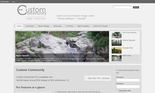
Custom Community is a BuddyPress theme that enables you to easily build a website with all of BuddyPress’ built-in features: the easy-to-use jQuery slideshow, post templates with thumbnail integration, and a powerful options page for customizing every part of the theme.
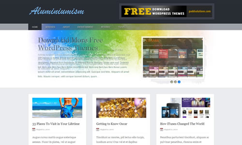
The Aluminiumism theme has a grungy watercolor style yet still maintains a classically clean look. It features a prominent content section, a dropdown menu, subscription buttons (Twitter, Facebook and RSS), an automatic thumbnail resizer, widgets for popular and featured posts and featured videos, and a heck of a lot more.
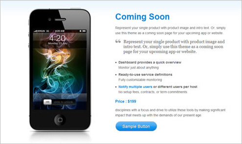
Landis is a simple one-page landing or “Under construction” WordPress theme. It keeps your users informed while you build your amazing new website. The quick landing page simply tells visitors what is going on and when your website will launch.
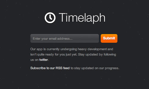
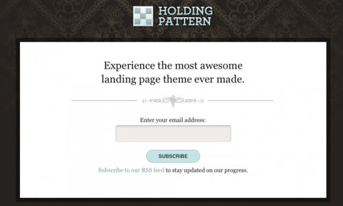
Timelaph is a sleek, dark, spaced-out theme for landing pages and email newsletter subscription pages. It integrates easily with Feedburner to redirect RSS feeds and help build your email subscriptions.
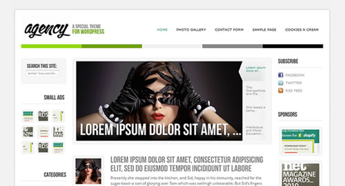
Agency is a magazine-style theme that puts your content in a beautiful wrapper, complete with subtle, elegant page elements. It features a custom slideshow, a built-in contact form, custom gallery styles with lightbox functionality, and two widget-ized sidebars.
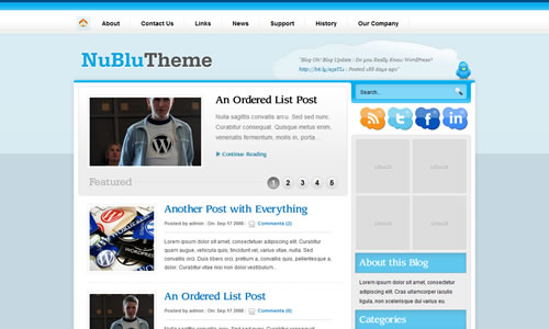
This sleek blue theme comes with a configurable slider, drop-down menus and Cufon-enabled headlines. It also comes with automatic thumbnail generation and the WordPress 3+ menu system, and it sports a Twitter bird that sings your latest tweets.
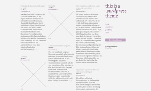
This theme was designed by Maleika Esther Attawel. It offers a warm and comfortable environment for personal musings. It comes in two flavors: HTML 4.01 and HTML5. Both German and English versions are included in the download package.

.jpg)


0 nhận xét:
Đăng nhận xét